
Introduction
Every website owner faces the challenge of turning casual visitors into paying customers, yet many often overlook the simple adjustments that can drive significant results. Learning how to improve conversions easily usually starts with refining specific high-impact elements rather than tearing down an entire marketing strategy. Small, data-driven changes to your calls to action (CTA) and page layout can yield immediate lifts in performance without requiring extensive resources or heavy lifting.
For example, modifying button copy to use the first person can generate a substantial lift. Switching from "Start your trial" to "Start my trial" has been shown to increase conversions significantly. Similarly, ensuring your primary value proposition sits "above the fold" ensures visitors immediately understand your offer. You can also boost engagement by:
- Adding contrasting colors to CTA buttons to make them stand out against the page palette
- Including reassuring microcopy below buttons, such as "No credit card required"
- Using action-specific text like "Get My Report" instead of generic terms like "Submit"
Implementing these tactics creates a smoother user journey and removes friction points that stop users from converting. By focusing on these proven optimization strategies, you can build a more effective digital experience that maximizes the value of your existing traffic.
Convert Visitors Faster
Remove speed barriers with Hostinger. Reliable hosting ensures your optimized CTAs load instantly, turning visitors into customers.
Tip 1: Shift to First-Person CTA Copy
Changing your button copy from a second-person to a first-person perspective is a highly effective method for improving conversions easily. Shifting the phrasing from "Start your trial" to "Start my trial" generates a significant lift in performance. This simple linguistic change aligns the button text with the user's internal monologue, making the action feel more personal and directly beneficial to them.
Beyond pronouns, specificity matters. Generic terms like "Submit" often underperform compared to action-oriented alternatives. For instance, using "Get My Report" provides clear value and sets expectations, resulting in a higher conversion rate than a vague label. To maximize the impact of this adjustment, combine it with trust-building microcopy.
- Change pronouns: Replace "your" with "my" to create a sense of ownership (e.g., "Create my account").
- Be specific: Describe exactly what the user receives (e.g., "Download my eBook" instead of "Click here").
- Add reassurance: Include microcopy below the button, such as "No credit card required," to reduce friction.
Implementing these specific copy changes requires minimal development effort but can yield substantial gains in your conversion rates.
Tip 2: Add Trust-Building Microcopy
Small snippets of text, known as microcopy, placed near your call-to-action (CTA) buttons can significantly reduce purchase anxiety. This text addresses specific fears users have before clicking, such as hidden fees or spam. Adding a simple assurance below a button can increase conversion rates by approximately 15%. Users need to feel safe that the action is low-risk and reversible.
To easily improve conversions, you must anticipate objections and neutralize them instantly with supporting text. Do not let users guess what happens after they click.
- Reassure financial safety: Use phrases like "No credit card required" or "Cancel anytime" to remove financial risk.
- Clarify the outcome: Replace vague "Submit" buttons with action-specific microcopy such as "Get your free guide instantly."
- Guarantee privacy: Add a short note stating "We respect your privacy" or "No spam, ever" next to email signup forms.
Implementing these minor text adjustments requires minimal effort but fosters the immediate trust necessary to turn hesitant visitors into customers.
Tip 3: Optimize for High Contrast Visuals
Visual hierarchy directs user attention toward critical actions. Using a contrasting color for your primary Call to Action (CTA) button compared to the rest of the page palette can generate a significant lift in conversions. This visual distinction helps elements stand out, guiding the eye naturally and reducing the cognitive load required to understand the next step.
To improve conversions easily through contrast, you must evaluate your current design choices. Ensure that key interactive elements pop against the background.
- Select complementary colors: Pick a CTA color that opposes your site's main theme color to create immediate visual separation.
- Test button variations: Use A/B testing to compare high-contrast options against your standard design to measure performance impact.
- Check text readability: Verify that text color contrasts sufficiently with background colors to prevent user strain.
For example, if your website uses a palette of soft blues and grays, a vibrant orange or green button will draw the eye immediately. Small adjustments to color saturation and brightness can make the difference between a user scrolling past or clicking to convert.
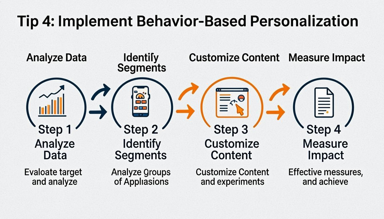
Tip 4: Implement Behavior-Based Personalization
To improve conversions easily, shift your strategy from generic persuasion to logical continuity based on user actions. Companies often waste effort adding more pop-ups and calls to action, when the real solution is reducing friction by recognizing established preferences. For example, if a customer views a specific product, showing that same item in different colors or suggesting related items creates a seamless experience rather than a repetitive sales pitch. Tailoring interactions makes users feel valued and significantly reduces the time it takes for them to reach their "aha" moment.
You can implement this strategy by using existing data to tailor the user journey dynamically. Instead of treating every visitor the same, adjust your content to reflect their specific interests and behaviors.
- Display relevant recommendations: Show products or content based on past browsing activity or previous purchases.
- Extend interactions logically: If a user engages with a specific feature or page, follow up with complementary options rather than unrelated promotions.
- Utilize demographic data: Customize offers and messaging to align with the specific needs of different visitor segments.
Tip 5: Streamline Forms with Conditional Logic
When users encounter forms that appear lengthy or ask irrelevant questions, they often abandon the process. Implementing conditional logic ensures that visitors only see fields applicable to their specific answers, significantly reducing friction. Hiding irrelevant fields can generate an 11% lift in conversions, while structuring forms into multiple steps yields a 21% improvement even when the total number of fields remains the same.
To apply this strategy, analyze your current form data to identify which fields cause drop-offs. Group related questions into logical categories and only reveal subsequent sections based on previous inputs. For example, if a user selects "Business" as their customer type, display a "Company Name" field, but hide it if they select "Individual."
- Implement progressive disclosure: Only show the next set of questions after the user completes the current step.
- Hide non-essential fields: Use conditional rules to remove options that do not apply to the user's selected path.
- Clarify the path: Use clear, concise copy to explain why specific information is being requested.
Simplifying the user interface in this manner keeps the focus on the task at hand, making it easier for visitors to complete the form and convert.
Tip 6: Place Value Propositions Above the Fold
Positioning your primary value proposition prominently is essential for capturing attention immediately. Visitors should understand exactly what you offer within seconds of arriving, without needing to scroll. If users cannot identify the benefit of your product or service instantly, they are likely to leave. Making this information the first thing they see reduces friction and guides them closer to their "aha" moment.
To improve conversions easily, ensure your headline and subheadline clearly communicate your unique selling points. Do not bury this information under large hero images or complex navigation menus. Instead, prioritize clarity and relevance at the very top of your homepage and key landing pages.
- Craft a compelling headline: Summarize your main benefit in one concise sentence.
- Support with a subheadline: Elaborate on how you solve a specific problem.
- Remove visual clutter: Keep the top section clean so the text remains the focal point.
- Avoid excessive CTAs: Focus on the value first before asking for a commitment.
Tip 7: Use Action-Specific Button Labels
Generic labels like "Submit" or "Click here" often fail to motivate users because they lack context and value. To learn how to improve conversions easily, you must clarify exactly what a user receives after clicking. Replacing generic terms with specific, action-oriented copy can significantly boost performance. For instance, changing "Submit" to "Get My Report" has been shown to generate a substantial lift in engagement rates.
Action-specific buttons reduce cognitive friction by setting clear expectations before the click occurs. You should describe the asset or action directly on the button itself. Additionally, adopting first-person phrasing, such as "Start my trial" instead of "Start your trial," creates a stronger personal connection with the user.
- Define the outcome: Use descriptive verbs like "Download," "Reserve," or "Get" followed by the specific item.
- Personalize the copy: Switch to first-person language to make the user feel like the active participant.
- Add trust signals: Include reassuring microcopy below the button, such as "No credit card required," to lower hesitation.
Test these variations to find the precise wording that resonates best with your audience.
Conclusion
Optimizing your website for better performance is an ongoing process of refinement and testing. By focusing on data-driven decisions rather than assumptions, you can implement strategies that show you how to improve conversions easily without overhauling your entire infrastructure. Small adjustments, such as shifting CTA copy to the first person or using contrasting button colors, often yield significant lifts in engagement.
To solidify your gains, prioritize rigorous testing and clear communication of your value proposition. Ensure your primary message is visible above the fold, and maintain a detailed log of all experiments to track what resonates with your audience. Avoid common pitfalls like changing too many variables at once, which obscures the true drivers of success.
Begin your optimization journey by focusing on these high-impact actions:
- A/B test critical elements: Experiment with headlines, hero images, and call-to-action button shapes or sizes.
- Optimize forms: Implement multi-step forms or conditional logic to reduce friction.
- Refine CTAs: Use action-specific, first-person copy like "Get My Report" and add reassuring microcopy such as "No credit card required."
Start applying these techniques today to transform visitor traffic into valuable customers.
Comments
0