Introduction
Most businesses pour their energy into driving traffic to their website, yet they often overlook a fundamental flaw that silently kills conversions. Even with a sleek design, your website is missing this crucial element: a deep understanding of actual user behavior. Relying on basic metrics like bounce rates or session duration just isn't enough, as they don't reveal why visitors are leaving.
To truly connect with your audience, you need to visualize and analyze trends in their actions. It’s time to look beyond surface-level statistics to observe live interactions and map out complete customer journeys. Think about how a popular streaming platform achieves success by stripping away clutter and focusing on essentials—like a single, prominent "Play" button. They prioritize simplicity and let the content speak for itself.
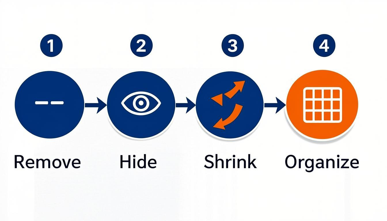
Effective optimization really comes down to a prioritization framework: remove, hide, shrink, and organize. If an element doesn't serve a clear purpose, it should probably go. To identify these opportunities, start by capturing all visitor interactions to see behavior patterns, archiving obsolete content in favor of something more engaging, and double-checking that your analytics tools are actually working so you can set actionable KPIs.
Addressing this gap transforms your site from a static brochure into a high-performing asset.
Build a Faster Site
Optimize performance and behavior tracking with Hostinger’s reliable, affordable hosting.
Fixe 1: Simplifying the Interface Using the "Remove, Hide, Shrink, Organize" Framework
If your website is missing this crucial element, you risk overwhelming visitors before they even have a chance to convert. Simplicity is critical for a positive user experience; cluttered interfaces only confuse people and obscure your value proposition. A prime example of minimalism is the Netflix homepage. It focuses solely on essential artwork and a clear "Play" call to action against a dark background. By letting the content speak, they avoid presenting users with too many choices at once.
To achieve this level of clarity, try applying the "Remove, Hide, Shrink, Organize" framework as a prioritization exercise:
- Remove: Ask if an element is absolutely necessary. If not, delete it entirely to reduce cognitive load.
- Hide: Tuck away non-essential features within menus so they are accessible but not distracting.
- Shrink: Reduce the visual size of less important elements without hiding them completely.
- Organize: Group related items logically to create a predictable structure and improve scannability.
Implementing this strategy ensures your interface remains intuitive and focused on what users actually need.
Fixe 2: Establishing and Documenting Design Usage Guidelines
A component is only effective if everyone on the team understands how to use it correctly. If your website is missing this crucial element, your user interface will likely suffer from inconsistencies that confuse visitors and hurt conversion rates. You need to create a living document that outlines the rules for every design asset, ensuring your team maintains a cohesive look as the site grows.
Be specific about exactly when to use a primary button versus a secondary one, and define the required behavior for form fields. You also need to enforce strict accessibility standards for each component to guarantee usability for all visitors.
To implement this effectively, document the following parameters:
- Interaction States: Define rules for hover, focus, and active states for all clickable elements.
- Touch Targets: Ensure all interactive areas meet a minimum size of 48x48 pixels to accommodate mobile users.
- Typography: Set base font sizes, such as a minimum of 16px for body text, and establish hierarchy rules.
- Spacing: Standardize whitespace usage to prevent cluttered layouts that overwhelm users.
This kind of documentation prevents design drift and significantly reduces decision fatigue during development.
Fixe 3: Why Your Website Is Missing This Crucial Element: Strategic Social Proof Placement
Trust needs to be established immediately, not saved for the end of the user journey. If your website is missing this crucial element, visitors likely exit before converting because they lack validation. Burying trust signals until it is too late is a critical error. Common issues include testimonials hidden on secondary pages and a complete lack of visible social proof near the top of the funnel.
To fix this, integrate validation right where users are making decisions. Place logos, client names, or star ratings directly above or near your primary call-to-action. Ensure that human elements, such as team photos or founder signatures, are visible early to establish who is behind the business. Consistency is key, so verify that this information is current and matches across all pages.
- Place testimonials and trust badges above the fold on high-traffic landing pages
- Display recognizable client logos immediately next to conversion buttons
- Add team photos or signatures to the homepage to humanize the brand
- Audit every page to ensure trust signals are present, not just on the "About Us" section
Fixe 4: Optimizing Mobile Responsiveness and Touch Targets
If your website is missing this crucial element, your mobile rankings are going to suffer significantly. Search engines now utilize mobile-first indexing, meaning the mobile version of your site determines your overall search performance. A layout that functions perfectly on a desktop often frustrates users on smaller screens, leading to higher bounce rates and lower engagement.
To solve this, you need to ensure your design adapts fluidly to all viewports. This involves more than just shrinking text; it requires a fundamental rethink of spacing and interactivity. Touch targets must be large enough to prevent accidental clicks, and content must remain legible without zooming.
- Ensure touch targets are at least 48x48 pixels to accommodate finger tapping.
- Use a minimum font size of 16 pixels for body text to maintain readability.
- Shorten paragraphs and increase whitespace to improve scannability.
- Eliminate intrusive interstitials and pop-ups that block content on small screens.
Always test on real devices rather than relying solely on browser emulators. Real-world testing reveals usability friction that simulation tools often miss.
Fixe 5: Implementing Behavioral Analytics to Visualize User Journeys
If your website is missing this crucial element, you are essentially guessing why visitors leave instead of knowing the facts. Standard analytics track numbers, but behavioral tools reveal the "why" behind user actions. By capturing interactions rather than just page views, you can visualize complete customer journeys and identify friction points that destroy conversions.
The best advice here is to move beyond basic statistics to observe live user interactions. Use session recordings to see exactly where users hesitate, rage-click, or drop off. This allows you to distinguish between a design flaw and a usability issue. Simplify your interface based on these observations to help users navigate intuitively to your calls to action.
To implement this effectively:
- Integrate session replay tools to map user flows from entry to exit
- Analyze where users get "stuck" or wander without converting
- Apply a removal framework to eliminate non-essential elements that distract from primary goals
- Verify that your tracking setup accurately captures visitor behavior for a unified view
Continuously refine the user experience based on this data to ensure steady improvement in satisfaction and conversion rates.
Conclusion
A successful digital presence requires blending specific design elements with clear communication. If users cannot grasp your purpose within seconds, your website is missing this crucial element: clarity. Generic language often fails to connect, so use specific, friendly wording that explains exactly how you solve problems for your audience.
Take immediate steps to refine your user experience and interface. Follow this simple prioritization framework to declutter your pages:
- Remove non-essential features
- Hide complex secondary options
- Shrink less critical elements
- Organize what remains
A clean, focused design—like a streaming homepage with a single "Play" button—prevents overwhelming visitors. Regularly audit your site to ensure technology and brand narrative work in harmony. Test your homepage by asking a stranger to explain your business in under ten seconds. If they hesitate, rewrite your headline and intro. Don't let a confusing interface cost you conversions. Optimize your layout today to meet modern expectations and turn visitors into loyal customers.

Comments
0